
Big Menu
code 1
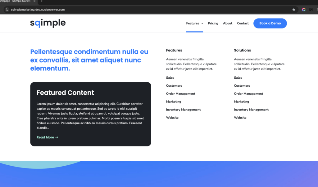
Big Menu is an enhanced header navigation pattern that expands into a large, two-column mega menu.
It is powered by WordPress menus, ACF Options fields, and JavaScript interactions that adapt between desktop hover and mobile click behaviour.
This system is designed to:
-
Highlight key navigation sections
-
Surface featured content
-
Remain accessible and responsive across breakpoints
HTML / PHP Structure
Purpose: Outputs the header, navigation, and Big Menu content.
Key requirements
-
A menu item must have the class .has-big-menu
→ This acts as the trigger for the Big Menu.
-
Big Menu content is rendered once, directly after the header.
-
Content is managed via ACF Options Page fields.
Content sources (ACF – Options)
-
Introduction – Rich text content shown in the first column
-
Featured Content – A selected post displayed as a highlight card
-
Menu Group (Repeater)
-
Menu Header
-
Menu Description
-
Menu Items (ACF Link fields)
-
Structural notes
-
.big-menu is hidden by default using max-height
-
.big-menu_container uses a responsive CSS grid
-
The header remains fixed while the Big Menu expands beneath it
Important:
The Big Menu will only activate if the trigger menu item includes .has-big-menu.
                                                        <?php
/**
 * This is the template that displays all of the <head> section and everything up until <main id="content">
 *
 * @link https://developer.wordpress.org/themes/basics/template-files/#template-partials
 * @package sqimplemarketing
 */

?>
<!doctype html>
<html <?php language_attributes(); ?>>
<head>
<?php echo nucleo_tracking_scripts(); ?>
<meta charset="<?php bloginfo( 'charset' ); ?>">
<meta name="viewport" content="width=device-width, initial-scale=1">
<link rel="profile" href="https://gmpg.org/xfn/11">
<link rel="preconnect" href="https://fonts.googleapis.com">
<link rel="preconnect" href="https://fonts.gstatic.com" crossorigin>
<link href="https://fonts.googleapis.com/css2?family=Nunito+Sans:ital,opsz,wght@0,6..12,200..1000;1,6..12,200..1000&family=Poppins:wght@400;500;600&display=swap" rel="stylesheet">
<?php wp_head(); ?>
<title><?php wp_title(); ?></title>
</head>
<body <?php body_class(); ?>>
<?php wp_body_open(); ?>
<a class="skip-link screen-reader-text" href="#content"><?php esc_html_e( 'Skip to content', 'nucleo' ); ?></a>
<div class="nav__overlay"></div>
<div class="page-wrap">
	<header class="header">
		<div class="header__container">
			<div class="header__logo">
				<?php echo nucleo_theme_logo(); ?>
				<?php if ( ! empty( get_field( 'footer_logo', 'options' ) ) ) : ?>
					<a href="<?php echo esc_url( home_url( '/' ) ); ?>" rel="home" class="rev-logo a--noline">
						<?php
							echo wp_get_attachment_image(
							get_field( 'footer_logo', 'options' ),
							'full',
							false,
							[ 'class' => 'rev-logo' ]
							);
						?>
					</a>
				<?php else : ?>
					<?php echo nucleo_theme_logo(); ?>
				<?php endif; ?>
			</div>
			<button class="nav__toggle" aria-expanded="false"><span class="nav__toggle__icon"></span><span class="screen-reader-text">Menu</span></button>
			<nav class="nav__container">
				<div class="nav__menu menu-group">
					<?php
					// Display navigation menu.
					if ( has_nav_menu( 'header-1' ) ) {
						wp_nav_menu(
							array(
								'container'      => false,
								'items_spacing'  => 'discard',
								'items_wrap'     => '%3$s',
								'menu_class'     => '',
								'theme_location' => 'header-1', // registered in theme-setup.php.
								'walker'         => new Nucleo_Accessible_Header_Walker(),
							)
						);
					}
					?>
				</div>
			</nav>
		</div>
	</header>


	<!-- ADD Class on MENU  .has-big-menu -->

<?php $introduction = get_field('introduction', 'options');
$featured_post = get_field('featured_content', 'options');
$rows = get_field('menu_group', 'options'); ?>
	<!-- has-big-menu -->
	<div class="big-menu">
		<div class="big-menu_container alignwide py-md">
			<div class="big-menu_column">
				<?php if ( ! empty( $introduction ) ) : ?>
					<?php echo wp_kses_post( $introduction ); ?>
				<?php endif; ?>
				<?php if ( $featured_post ) : $post_id = $featured_post->ID;?>
					<div class="featured_post has-darkgrey-background-color has-white-color has-border-radius mt-sm">
					<h3><?php echo esc_html( get_the_title( $post_id ) ); ?></h3>
					<p class="excerpt">
						<?php echo esc_html( get_the_excerpt( $post_id ) ); ?>
					</p>
					<a href="<?php echo esc_url( get_permalink( $post_id ) ); ?>" class="read-more has-mint-color">Read More</a>
					</div>
				<?php endif; ?>
			</div>
			<div class="big-menu_column">

				<?php if ( $rows ) : ?>

					<?php foreach ( $rows as $row ) :
						$menu_header      = $row['menu_header'];
						$menu_description = $row['menu_description'];
						$menu_items       = $row['menu_items']; // child repeater
					?>

						<div class="menu-group">

						<?php if ( $menu_header ) : ?>
							<h5 class="mb-0"><?php echo esc_html( $menu_header ); ?></h5>
						<?php endif; ?>

						<?php if ( $menu_description ) : ?>
							<p class="mb-0"><?php echo esc_html( $menu_description ); ?></p>
						<?php endif; ?>

						<?php if ( $menu_items ) : ?>
							<div class="menu-items">

							<?php foreach ( $menu_items as $item ) :
								$link = $item['menu']; // ACF Link field
							?>

								<?php if ( $link ) :
								$link_url    = $link['url'];
								$link_title  = $link['title'];
								$link_target = $link['target'] ?: '_self';
								?>
								<a
									class="menu-item"
									href="<?php echo esc_url( $link_url ); ?>"
									target="<?php echo esc_attr( $link_target ); ?>"
								>
									<?php echo esc_html( $link_title ); ?>
								</a>
								<?php endif; ?>

							<?php endforeach; ?>

							</div>
						<?php endif; ?>

						</div>

					<?php endforeach; ?>

				<?php endif; ?>

			</div>
		</div>
	</div>
JavaScript Behaviour
Purpose: Controls menu state, accessibility, and responsive interactions.
Core behaviour
-
Desktop (≥ 1024px)
-
Opens on hover
-
Closes on mouse leave
-
Keeps menu open while hovering the Big Menu itself
-
-
Mobile (≤ 1023px)
-
Opens and closes on click
-
Disables hover logic entirely
-
Key interactions
-
Toggles big-menu-open on:
-
.has-big-menu
-
<body>
-
-
Dynamically sets max-height for smooth open/close animation
-
Automatically closes Big Menu when:
-
Main navigation toggle is opened
-
Viewport switches from mobile → desktop
-
-
Integrates with existing header logic:
-
Scroll-based header visibility
-
ARIA attributes
-
Keyboard navigation (ESC, TAB)
-
Accessibility considerations
-
Menu state is reflected via ARIA attributes
-
Keyboard users can escape and tab safely
-
Hover behaviour is disabled on touch devices
                                                        const header = document.querySelector( '.header' );
const navBreakpoint = getComputedStyle( document.body ).getPropertyValue( '--header-breakpoint' ); // Convert REM to PX.
const navSubmenus = document.querySelectorAll( '.header .nav__menu > .menu-item-has-children' );
const navButtonsOpenSubmenu = document.querySelectorAll( '.header .nav__menu .nav__btn__open' );
const navButtonsCloseSubmenu = document.querySelectorAll( '.header .nav__menu .nav__btn__close' );
const navToggle = document.querySelector( '.header .nav__toggle' );
const navSearchClose = document.querySelector( '.header .nav__search__close' );
const navSearchInput = document.querySelector( '.header .nav__search input' );
const navSearchOpen = document.querySelector( '.header .nav__search__open' );

let scrollPosition = window.scrollY,
	lastScrollPosition = scrollPosition,
	ticking = false;

/**
 * Helpers
 */
const getWidth = () => { // eslint-disable-line
	return Math.max(
		document.body.offsetWidth,
		document.documentElement.offsetWidth,
		document.documentElement.clientWidth
	);
};

const getHeight = () => { // eslint-disable-line
	return Math.max(
		document.body.offsetHeight,
		document.documentElement.offsetHeight,
		document.documentElement.clientHeight
	);
};

/**
 * Reset menu to default state.
 */
const nucleoResetMenu = () => {
	navButtonsOpenSubmenu.forEach( ( el ) => {
		el.setAttribute( 'aria-expanded', 'false' );
	} );
	document.body.classList.remove( 'search--is-open' );
	document.body.classList.remove( 'nav--is-open' );
	navToggle.setAttribute( 'aria-expanded', 'false' );
};

/**
 * Toggle menu item open.
 *
 * @param {Object} el
 * @param {string} state
 */
const nucleoToggleAriaExpanded = ( el, state ) => {
	if ( state || 'true' !== el.getAttribute( 'aria-expanded' ) ) {
		el.setAttribute( 'aria-expanded', 'true' );
	} else {
		el.setAttribute( 'aria-expanded', 'false' );
	}
};

/**
 * Changes the position of submenus so they always fit the screen horizontally.
 *
 * @param {Object} li
 */
const nucleoSubmenuPosition = ( li ) => {
	let subMenu = li.querySelector( '.menu-group' ),
		rect,
		right,
		left;

	if ( ! subMenu ) {
		return;
	}

	rect = subMenu.getBoundingClientRect();
	right = Math.round( rect.right );
	left = Math.round( rect.left );

	if ( document.body.classList.contains( 'rtl' ) ) {
		if ( left < 0 ) {
			subMenu.classList.add( 'nav__submenu--reposition-left' );
		}
	} else if ( right > getWidth() ) {
		subMenu.classList.add( 'nav__submenu--reposition-right' );
	}
};

/**
 * Toggle search overlay.
 */
if ( navSearchOpen ) {
	navSearchOpen.addEventListener( 'click', () => {
		if ( ! document.body.classList.contains( 'search--is-open' ) ) {
			nucleoToggleAriaExpanded( navSearchOpen );
			nucleoResetMenu();
			document.body.classList.add( 'search--is-open' );
			if ( navSearchInput ) {
				setTimeout( () => {
					navSearchInput.focus();
					navSearchInput.select();
				}, 100 );
			}
		} else {
			nucleoToggleAriaExpanded( navSearchOpen );
			document.body.classList.remove( 'search--is-open' );
			navSearchOpen.focus();
		}
	} );
}

if ( navSearchClose ) {
	navSearchClose.addEventListener( 'click', () => {
		document.body.classList.remove( 'search--is-open' );
		header.classList.remove( 'header--is-opaque' );
		navSearchOpen.focus();
	} );
}

/**
 * Open mobile navigation menu from toggle
 */
if ( navToggle ) {
	navToggle.addEventListener( 'click', () => {
		if ( 'true' !== navToggle.getAttribute( 'aria-expanded' ) ) {
			navToggle.setAttribute( 'aria-expanded', 'true' );
			document.body.classList.remove( 'search--is-open' );
			document.body.classList.add( 'nav--is-open' );
			navToggle.focus();
		} else {
			nucleoResetMenu();
		}
	} );
}

/**
 * Handle clicks on submenu toggles.
 */
if ( navButtonsOpenSubmenu ) {
	navButtonsOpenSubmenu.forEach( ( el ) => {
		el.addEventListener( 'click', () => {
			el.closest( '.menu-group' )
				.querySelectorAll( '.nav__btn__open' )
				.forEach( ( button ) => {
					if ( button !== el ) {
						button.setAttribute( 'aria-expanded', 'false' );
					} else {
						// Toggle aria-expanded on the button.
						nucleoToggleAriaExpanded( el );
						document.body.classList.add( 'nav--is-open' );
					}
				} );
			el.parentNode
				.querySelectorAll( '.menu-group > .menu-item:last-child > a' )
				.forEach( ( linkEl ) => {
					linkEl.addEventListener( 'blur', ( event ) => {
						if ( ! el.parentNode.contains( event.relatedTarget ) ) {
							el.setAttribute( 'aria-expanded', 'false' );
						}
					} );
				} );
		} );
	} );
}

/**
 * Handle clicks on submenu back toggles.
 */
if ( navButtonsCloseSubmenu ) {
	navButtonsCloseSubmenu.forEach( ( el ) => {
		el.addEventListener( 'click', () => {
			nucleoToggleAriaExpanded(
				el.closest( '.nav__submenu' ).previousElementSibling
			);
		} );
	} );
}

/**
 * Handle tabbing through menus, sub-menus and search.
 */
document.addEventListener( 'keyup', ( event ) => {
	let activeEl = document.activeElement;

	// Nav
	if ( document.body.classList.contains( 'nav--is-open' ) ) {
		switch ( event.key ) {
			case 'Escape':
				nucleoResetMenu();
				navToggle.focus();
				break;
			case 'Tab':
				if ( getWidth() >= navBreakpoint ) {
					if ( null !== activeEl.closest( '.menu-group' ) && null === activeEl.closest( '.nav__submenu' ) ) {
						nucleoResetMenu();
					}
				}
				if ( null === activeEl.closest( '.menu-group' ) ) {
					nucleoResetMenu();
				}
				break;
		}
	}

	// Search.
	if ( document.body.classList.contains( 'search--is-open' ) ) {
		switch ( event.key ) {
			case 'Escape':
				event.preventDefault();
				document.body.classList.remove( 'search--is-open' );
				nucleoResetMenu();
				break;
			case 'Tab':
				if ( document.activeElement.closest( '.searchform' ) === null ) {
					document.body.classList.remove( 'search--is-open' );
				}
		}
	}
} );

/**
 * Hover states for sub-menu items
 */
if ( navSubmenus ) {
	navSubmenus.forEach( ( element ) => {
		let button = element.querySelector( '.nav__btn__open' );
		element.addEventListener( 'mouseenter', () => {
			if ( button && getWidth() >= navBreakpoint ) {
				nucleoToggleAriaExpanded( button, true );
				document.body.classList.add( 'nav--dropdown-is-open' );
				nucleoSubmenuPosition( element );
			}
		} );
		element.addEventListener( 'mouseleave', () => {
			if ( button && getWidth() >= navBreakpoint ) {
				nucleoToggleAriaExpanded( button, false );
				document.body.classList.remove( 'nav--dropdown-is-open' );
			}
		} );
	} );
}

/**
 * Update header style based on scroll position.
 */
const nucleoHeaderPosition = () => {
	scrollPosition = window.scrollY;
	// Header opacity.
	if ( scrollPosition > header.offsetHeight ) {
		header.classList.add( 'header--is-opaque' );
	} else {
		header.classList.remove( 'header--is-opaque' );
	}
	// Header visibility.
	if ( scrollPosition > lastScrollPosition && scrollPosition > ( header.offsetHeight + 100 ) ) {
		header.classList.add( 'header--is-hidden' );
	} else {
		header.classList.remove( 'header--is-hidden' );
	}
	// Scroll direction.
	if ( scrollPosition > lastScrollPosition ) {
		document.body.classList.add( 'scrolling-down' );
		document.body.classList.remove( 'scrolling-up' );
	} else {
		document.body.classList.add( 'scrolling-up' );
		document.body.classList.remove( 'scrolling-down' );
	}
	lastScrollPosition = scrollPosition;
};

/**
 * Load.
 */
document.addEventListener( 'DOMContentLoaded', () => {
	nucleoHeaderPosition();
} );

/**
 * Scroll.
 */
window.addEventListener( 'scroll', () => {
	if ( ! ticking ) {
		window.requestAnimationFrame( () => {
			nucleoHeaderPosition();
			ticking = false;
		} );
		ticking = true;
	}
} );

/**
 * Resize.
 */
window.addEventListener( 'resize', () => {
	if ( ! ticking ) {
		window.requestAnimationFrame( () => {
			nucleoHeaderPosition();
			if ( document.activeElement.tagName !== 'INPUT' ) {
				nucleoResetMenu();
			}
			ticking = false;
		} );
		ticking = true;
	}
} );

document.addEventListener('DOMContentLoaded', () => {
  const menuTrigger = document.querySelector('.has-big-menu');
  const bigMenu = document.querySelector('.big-menu');
  const navToggle = document.querySelector('.header .nav__toggle');

  if (!menuTrigger || !bigMenu) return;

  let isOpen = false;
  const breakpoint = 1023;

  const openMenu = () => {
    bigMenu.style.maxHeight = bigMenu.scrollHeight + 'px';
    menuTrigger.classList.add('big-menu-open');
    document.body.classList.add('big-menu-open');
    isOpen = true;
  };

  const closeMenu = () => {
    bigMenu.style.maxHeight = '0';
    menuTrigger.classList.remove('big-menu-open');
    document.body.classList.remove('big-menu-open');
    isOpen = false;
  };

  const toggleMenu = () => {
    isOpen ? closeMenu() : openMenu();
  };

  // Close big menu when main nav toggle is clicked
  if (navToggle) {
    navToggle.addEventListener('click', () => {
      if (isOpen) closeMenu();
    });
  }

  const setupInteractions = () => {
    // Clear previous listeners
    menuTrigger.onmouseenter = null;
    menuTrigger.onmouseleave = null;
    bigMenu.onmouseenter = null;
    bigMenu.onmouseleave = null;
    menuTrigger.onclick = null;

    if (window.innerWidth <= breakpoint) {
      // 📱 Mobile — click toggle ONLY
      menuTrigger.onclick = (e) => {
        e.preventDefault();
        toggleMenu();
      };
    } else {
      // 🖥 Desktop — hover behaviour
      menuTrigger.onmouseenter = openMenu;
      menuTrigger.onmouseleave = closeMenu;
      bigMenu.onmouseenter = openMenu;
      bigMenu.onmouseleave = closeMenu;
    }
  };

  setupInteractions();

  // Resize handling
  window.addEventListener('resize', () => {
    const isMobile = window.innerWidth <= breakpoint;

    // ❗ Only auto-close when switching to desktop
    if (!isMobile && isOpen) {
      closeMenu();
    }

    setupInteractions();
  });
});
CSS / SCSS Styling
Purpose: Handles layout, animation, and visual state changes.
Key styling concepts
-
.big-menu uses max-height transitions for smooth animation
-
Fixed positioning ensures the menu aligns directly under the header
-
Grid layout adapts:
-
Two columns on desktop
-
Single column on tablet and mobile
-
-
Visual state is controlled via body classes:
-
.big-menu-open
-
.nav–is-open
-
.header–is-opaque
-
Header interaction
-
Header background and logo swap based on:
-
Scroll position
-
Big Menu open state
-
Hero presence
-
-
Arrow indicator rotates on open using ::after
Mobile considerations
-
Scroll locking is avoided
-
Big Menu becomes scrollable within viewport height
-
Touch targets are enlarged for usability
                                                        .nav__overlay {
	background: rgba(0, 0, 0, 0.5);
	cursor: pointer;
	height: 100%;
	left: 0;
	opacity: 0;
	position: fixed;
	top: 0;
	transition: all 0.5s;
	width: 100%;
	z-index: -1;
}

// If hero block exists.
body {
	&.nav--is-open{
		.nav__toggle__icon{
			background: 0 0 !important;
		}
	}
	&.has-hero {
		.header:not(.header--is-opaque) {
			background: transparent;
			// Add background to navbar when hovered for legibility.
			&:hover,
			&:focus-within {
				background: $white;
				border-bottom: 1px solid $lightgrey;
				.custom-logo-link{
					display: none;
				}
				.rev-logo{
					display: flex;
				}
				.menu-item{
					a:not(.a--noline,.wp-element-button,.wp-block-embed__placeholder,.wp-block-social-link-anchor){
						span{
							color: $black !important;
						}
					}
					&.btn-style{
						a{
							background-color: $brand !important;
							border: 1px solid $brand !important;
							span{
								color: $white !important;
							}
							&:hover{
								background-color: transparent !important;
								span{
									color: $brand !important;
								}
							}
						}
					}
				}
				.has-big-menu{
					a{
						span{
							&::after{
								filter: none !important;
							}
						}
					}
				}
				.nav__toggle__icon{
					background: $darkgrey;
					&::after,
					&::before{
						background: $darkgrey !important;
					}
				}
			}
		}
		#content {
			margin-top: calc(-1 * var(--header-height));
		}
	}
	&.big-menu-open,
	&:not(.has-hero) {
		.header {
			background: $white !important;
			border-bottom: 1px solid $lightgrey;
			.custom-logo-link{
				display: none;
			}
			.rev-logo{
				display: flex;
			}
			.menu-item{
				a:not(.a--noline,.wp-element-button,.wp-block-embed__placeholder,.wp-block-social-link-anchor){
					span{
						color: $black !important;
					}
				}
				&.btn-style{
					a{
						background-color: $brand !important;
						border: 1px solid $brand !important;
						span{
							color: $white !important;
						}
						&:hover{
							background-color: transparent !important;
							span{
								color: $brand !important;
							}
						}
					}
				}
			}
			.has-big-menu{
				a{
					span{
						&::after{
							filter: none !important;
						}
					}
				}
			}
			.nav__toggle__icon{
				background: $darkgrey;
				&::after,
				&::before{
					background: $darkgrey !important;
				}
			}
		}
	}
}
.header {
	@include nu-layout-container;
	background: $white;
	color: $black;
	position: fixed;
	width: 100%;
	top: 0;
	transform: translateY(0);
	transition: $transition-default;
	will-change: transform;
	z-index: 1000;
	@media only screen and (max-width:1023px) {
    	padding-left:1rem !important;
    	padding-right: 6px !important;
	}
	&__container {
		@include nu-layout-wide;
		align-items: center;
		display: flex;
		height: var(--header-height);
		justify-content: flex-end;
		position: relative;
		transition: all 0.5s;
		width: 100%;
	}
	// Comment this out to make header always fixed.
	/*&--is-hidden {
		transform: translateY(-100%);
	}*/
	&--is-opaque {
		background-color: $white;
		border-bottom: 1px solid $lightgrey;
		.custom-logo-link{
			display: none !important;
		}
		.rev-logo{
			display: flex !important;
		}
		.menu-item{
			a:not(.a--noline,.wp-element-button,.wp-block-embed__placeholder,.wp-block-social-link-anchor){
				span{
					color: $black !important;
				}
			}
			&.btn-style{
				a{
					background-color: $brand !important;
					border: 1px solid $brand !important;
					span{
						color: $white !important;
					}
					&:hover{
						background-color: transparent !important;
						span{
							color: $brand !important;
						}
					}
				}
			}
		}
		.has-big-menu{
			a{
				span{
					&::after{
						filter: none !important;
					}
				}
			}
		}
		.nav__toggle__icon{
			background: $darkgrey;
			&::after,
			&::before{
				background: $darkgrey !important;
			}
		}
	}
	&__logo {
		display: flex;
		margin-right: auto;
		padding-right: 0;
		position: relative;
		z-index: 1200;
		img,
		svg {
			max-height: var(--header-height);
			padding: 1.375rem 0;
			width: auto;
		}
		.rev-logo{
			display: none;
			transition: all 0.3s ease;
		}
		.custom-logo-link {
			display: block;
			transition: all 0.3s ease;
		}
	}
}
#content {
	margin-top: var(--header-height);
}
.nav__social {
	margin-left: $spacing-large;
	@include media-breakpoint-down(md) {
		display: none;
	}
}
.nav__toggle {
	align-items: center;
	appearance: none;
	background: transparent;
	border: 0;
	color: $white;
	cursor: pointer;
	display: grid;
	height: var(--header-height);
	padding: 0;
	place-items: center;
	position: relative;
	width: $minimum-tap-target;
	z-index: 1200;

	&__icon {
		transition: all 0.2s;
		height: 3px;
		border-radius: 1px;
		background: $white;
		width: 1.625rem;
		display: block;
		position: relative;

		&::before,
		&::after {
			content: "";
			height: 3px;
			border-radius: 2px;
			background: $white;
			width: 100%;
			display: block;
			position: absolute;
			transition: margin 0.1s 0.2s, transform 0.2s;
		}

		&::before {
			margin-top: -8px;
		}

		&::after {
			margin-top: 8px;
		}
	}
}

.nav__container {
	display: flex;
	flex-grow: 1;
	justify-content: flex-end;
	transition: $transition-default;
	position: relative;

	&_inner {
		max-width: 100%;
		overflow: hidden;
	}
}

.nav__menu {
	padding: 0;
	margin: 0;
	list-style: none;
	width: 100%;
}

.nav__btn {
	align-items: center;
	appearance: none;
	background: transparent;
	border: 0;
	color: $white;
	cursor: pointer;
	display: inline-flex;
	margin: 0;
	padding: 0;
	text-align: left;
}

// Navigation is open when navigation toggle has aria-expanded="true".
.nav--is-open {
	.nav__toggle__icon {
		background: transparent;

		&::before,
		&::after {
			transition: margin 0.2s, transform 0.1s 0.2s;
			margin-top: 0;
		}

		&::before {
			transform: rotate(45deg);
		}

		&::after {
			transform: rotate(-45deg);
		}
	}

	.nav__overlay {
		opacity: 1;
		z-index: 1000;
	}

	.header {
		transform: translateY(0) !important;
	}
}
.has-big-menu{
	a{
		@media only screen and (max-width:1023px) {
			position: relative;
		}
		span{
			padding-right: 1.25rem !important;
			position: relative;
			@media only screen and (max-width:1023px) {
				position: unset;
			}
			&::after{
				content: "";
				width: 9px;
				height: 100%;
				display: block;
				position: absolute;
				top:0;
				right: 0;
				transition: all .3s ease;
				background-image: url('data:image/svg+xml,<svg width="9" height="6" viewBox="0 0 9 6" fill="none" xmlns="http://www.w3.org/2000/svg"><path d="M7.53125 0.530273L4.03125 4.03027L0.53125 0.530273" stroke="%2321242B" stroke-width="1.5"/></svg>') !important;
				background-repeat: no-repeat !important;
				background-position: right !important;
				background-size: auto !important;
				filter: brightness(0) invert(1);
				@media only screen and (max-width:1023px) {
					width: 48px;
					background-position: center !important;
					border-left: 1px solid $lightgrey;
				}
			}
		}
		&:hover{
			span{
				&::after{
					transform: rotate(180deg);
					@media only screen and (max-width: 1023px) {
						transform: none;
					}
				}
			}
		}
	}
}
.nav__container{
	.nav__menu{
		@media only screen and (max-width:1023px) {
			border-top: 1px solid $lightgrey !important;
			.menu-item{
				border-bottom: 1px solid $lightgrey !important;
			}
		}
	}
}
.nav__menu>.menu-item>.nav__btn,
.nav__menu>.menu-item>a {
	position: relative;
	&::after{
		content: "";
		display: block;
		position: absolute;
		bottom: 0;
		width: 100%;
		border-bottom: 5px solid $brand;
		opacity: 0;
		visibility: hidden;
		transition: all 0.3s ease;
		@media only screen and (max-width:1023px) {
			display: none !important;
		}
	}
	&:hover{
		&::after{
			opacity: 1;
			visibility: visible;
		}
	}
}
.btn-style.menu-item{
	a::after{
		display: none !important;
	}
	@media only screen and (max-width:1023px) {
		padding: 1rem;
	}
}
.has-big-menu.big-menu-open{
	a{
		span{
			&::after{
				transform: rotate(180deg);
			}
		}
		&::after{
			opacity: 1 !important;
			visibility: visible !important;
		}
	}
}
.big-menu {
	@include nu-layout-container;
	max-height: 0;
	overflow: hidden;
	transition: max-height 0.35s ease;
	width: 100%;
	position: fixed;
	left: 0;
	top: var(--header-height);
	display: block;
	z-index: 9999;
	background-color: $white;
	padding: 0 var(--spacing-gutter);
	&_container{
		@include nu-layout-wide;
		display: grid;
		grid-template-columns: repeat(2,1fr);
		gap: clamp(3rem, 1.442rem + 4.328vw, 4.688rem);
		.big-menu_column{
			min-width: 0;
			&:last-child{
				display: grid;
				grid-template-columns: repeat(2,1fr);
				gap: clamp(3rem, 1.442rem + 4.328vw, 4.688rem);
				@media only screen and (max-width:767px) {
					grid-template-columns: 1fr;
				}
				.menu-group{
					min-width: 0;
					display: flex;
					justify-content: flex-start;
					align-items: flex-start;
					flex-direction: column;
					gap:1.25rem;
					.menu-items{
						display: flex;
						justify-content: center;
						align-items: flex-start;
						flex-direction: column;
						gap:1rem;
						.menu-item{
							font-weight: $font-weight-bold;
							margin-bottom: 0;
						}
					}
				}
			}
		}
		@media only screen and (max-width:992px) {
			grid-template-columns: 1fr;
		}
		.featured_post{
			padding: 2rem;
            .read-more{
                font-family: $font-family-secondary;
              	font-weight: $font-weight-semibold;
                background-image: url('data:image/svg+xml,<svg width="14" height="11" viewBox="0 0 14 11" fill="none" xmlns="http://www.w3.org/2000/svg"><path d="M0.74935 5.4165L12.416 5.4165" stroke="%23BAF2DF" stroke-width="1.5" stroke-linecap="round" stroke-linejoin="round"/><path d="M8.08333 10.0833L12.75 5.41667L8.08333 0.75" stroke="%23BAF2DF" stroke-width="1.5" stroke-linecap="round" stroke-linejoin="round"/></svg>') !important;
                background-repeat: no-repeat !important;
                background-position: right !important;
                background-size: auto !important;
                padding-right: 1.25rem;
				text-decoration: none;
                &:hover{
                    padding-right: 1.5rem;
                }
            }
		}
	}
}
.big-menu-open{
	.big-menu {
		border-top: 1px solid $lightgrey;
		border-bottom: 1px solid $lightgrey;
		&_container{
			@media only screen and (max-width: 992px) {
				max-height: calc(100vh - var(--header-height));
				overflow-y: auto;
				-webkit-overflow-scrolling: touch; // smooth iOS scrolling
			}
		}
	}
}